Introduction
Heartlands Coaching is led by Mary Vaughan and based in Tipperary. The company provides life and career coaching, HR consulting, and team training services.
Mary is an Executive, Career & Relationship Coach (ACC), Human Resources and Learning & Development Consultant. The first thing to strike you when you meet Mary is her contagious enthusiasm for people.
Challenges
The main challenges were to:
- Create a brand identity for Heartlands Coaching that draws together the unique combination of passions and experiences, for coaching and HR, that Mary Vaughan brings to the work of serving her clients.
- Differentiate Heartlands Coaching from competitors in the busy coaching space (currently unregulated).
- Create a brand that resonates with Mary Vaughan's vision of enabling clients to stay in the driving seat of their personal and professional development.
- Reflect the brand roots and future direction.
Strategy
I carried out research amongst clients to understand their specific needs and identify gaps in the market.
Brand Essence and Vision
Aligning the brand with the essence of the human heartland, emphasising empathy, growth, and resilience in leadership and personal development.
Opportunities and Threats
Help clients identify their own strengths and leverage these towards growth opportunities for achieving their potential in a fulfilling way. Focus on employee well-being. Acknowledge and plan for potential threats like tech advancements and resource limitations.
Visual Identity
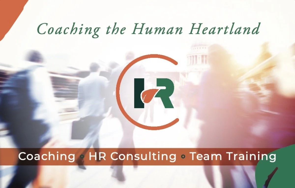
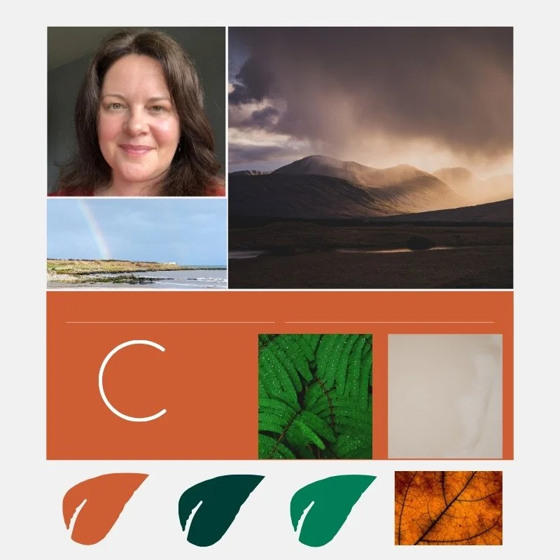
My goal was to create a visual identity that captures the brand's commitment to growth and personal development. I chose earthy tones and natural imagery to reflect Mary’s flexible, natural approach.
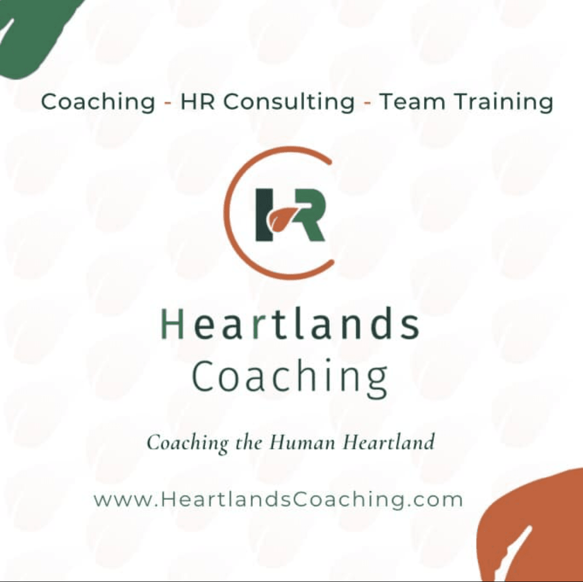
Logo and Colour Palette
The new logo connects the two core USPs: gentle coaching with tangible progress with deep expertise in HR management.
The look is fresh and contemporary, and works across different marketing materials and at different sizes.
The colour palette was chosen to convey warmth, reliability, and nature: integral values of Heartlands Coaching's brand.
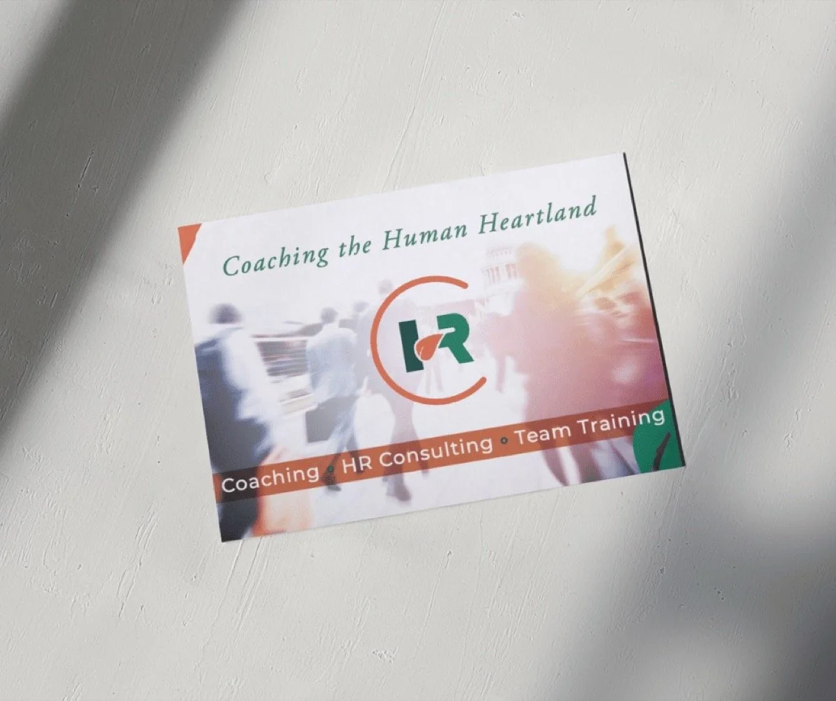
Marketing Materials
We developed a suite of marketing materials, including business cards, social media graphics, and website lead magnet.
Results
Since the rebranding, the new brand identity has played a pivotal role in attracting new clients, as well as re-engaging previous clients.