
Qualities of a good logo
Is your logo more madness than maven?
Piggyback your true brand
I'm a quiet admirer of those who can apply a good red lip and carry it off with aplomb. It is like the icing on the cake of attitude! However, when I've tried to apply it to my own lips, it always looks completely wrong. Not only will it not stay inside the line, it looks out of place with my character, way more madness than maven
Is your logo like this lipstick?
I often hear people refer to their need for a new logo. They're usually right (but not always).
The word logo is synonymous with brand, even though they are different - in the way a cherry isn't the whole cake.
Social media tends to focus heavily on this one aspect of branding. It's also much easier to grasp, mainly because a logo is a tangible item, unlike the rest of a brand - which is intangible, and largely based on perception.
There are plenty examples of amazing logo designs around the world, and one of my personal favourite pastimes is drooling over them ;)
What are the basic ingredients of a good logo?
Simple: simple shape and colour is easier for your audience to understand and recognise when they see it again. Simple does not mean easy to create, however; the opposite often holds true.
Memorable: a unique design helps your logo stand out from others, and aids recall.
Versatile: this ingredient is easily overlooked!
Just because a logo works in one setting does not mean it will work well across different mediums and sizes, eg from websites to business cards.
It needs to be thoroughly tested across all scenarios. Tedious but necessary!Relevant: a logo's job is to represent the overall brand.
This is a big responsibility. It is the symbol that carries the meaning behind the brand.
However, that doesn't mean it needs to literally show the product (in fact, it's usually better if it doesn't).
Timeless: the best logos avoid trends. Just like the stripy leg warmers craze of the 80s, a trendy logo risks quickly become outdated. (Sidenote, who else thinks it's a pity this craze ended?)
Even more practical considerations:
Is it scalable? Does its character and line weight hold up when resized, either larger or smaller.
Is it distinctive? It can feel risky to break the mould of what's popular in your space - especially if it's your first time branding your business. For example, think of the ubiquitous house or key shape in the real estate market, or the stack of stones for healing-related services.
Rather than opting for a cliché (which can certainly feel safer), your logo should help your business stand out from competitors via brand personality.Is it legible? Logos which include text can become illegible at smaller sizes.
Remember, we want to make it easy for audiences to read and understand - not make them work harder (because they won't!).Does it have a suite of options for different use cases?
A well-crafted logo will come with a full 'suitcase' of different options - to ensure there is always a best-fit option to pull out and wear, no matter what the occasion is.
For example… 🧳
- full colour versions, as both horizontal and stacked options;
- versions to use against pale and dark backgrounds;
- versions to use at full size, versions for micro use cases;
- different file types for different applications - print use requires a certain file type, digital - several others;
- a transparent background over an image requires a different type again.
- colour needs to hold up across digital and physical spaces.
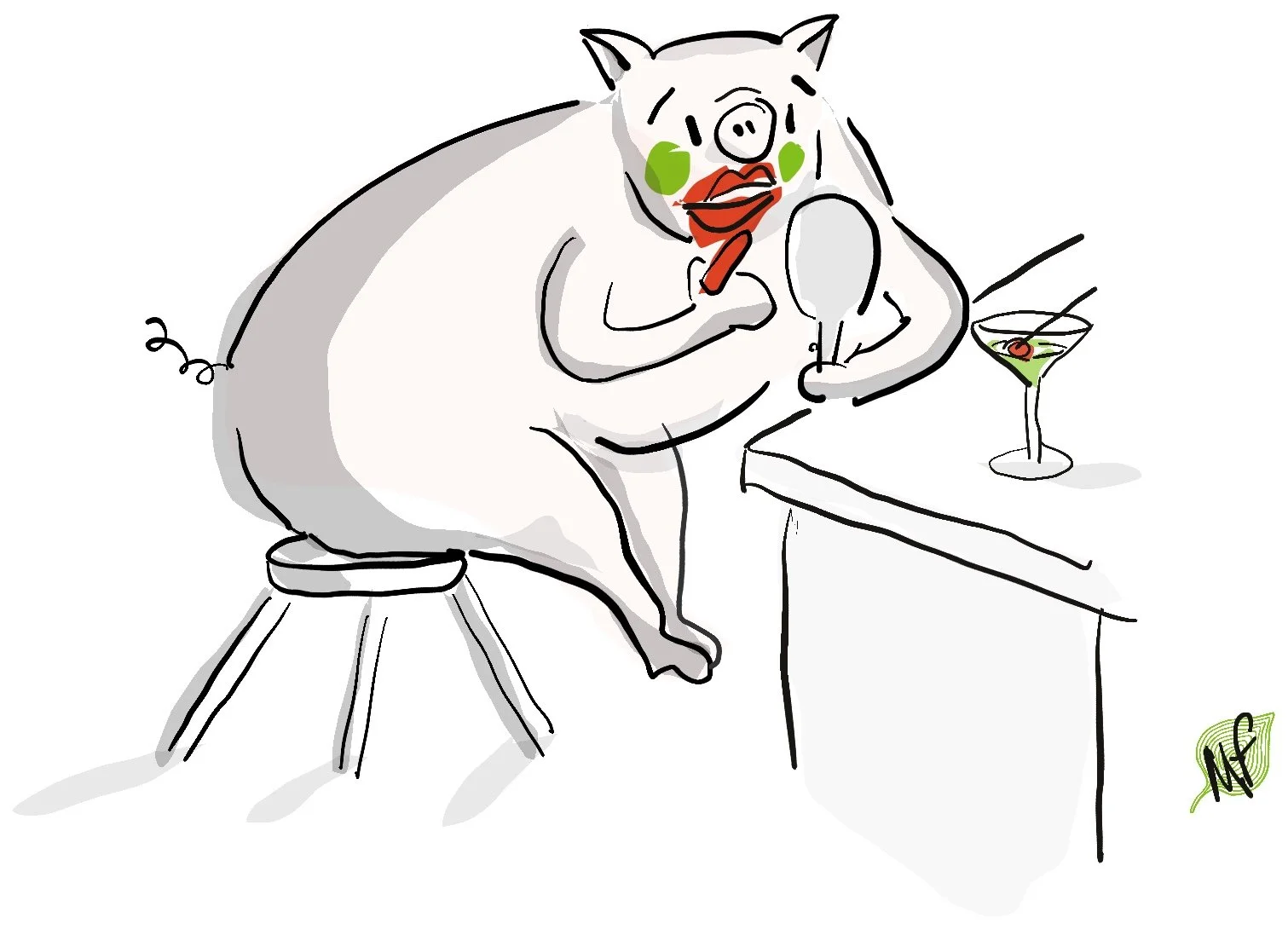
Even the most brilliant logo won't disguise a brand or business which is fundamentally flawed or which doesn't deliver on its promise! Aka lipstick on a pig! 😉
If you would like to chat about whether your current logo is helping or hindering your brand, feel free to email me or arrange a Virtual Cup of Tea.